Web Components As Lego Blocks
How we leveraged the flexibility of web components to build a powerful checkout solution for “everybody”

Tadeja Firman
May 22, 2023
This article’s purpose is to take you on a journey through our own experience with web components. My hope is that by the end of the article, you will have a clearer understanding of when web components might come handy for you.
A bit about me
I’m Tadeja – frontend team/tech lead at Rally, for the last 5 years I have been working on building customizable checkout solutions.
A bit about Rally
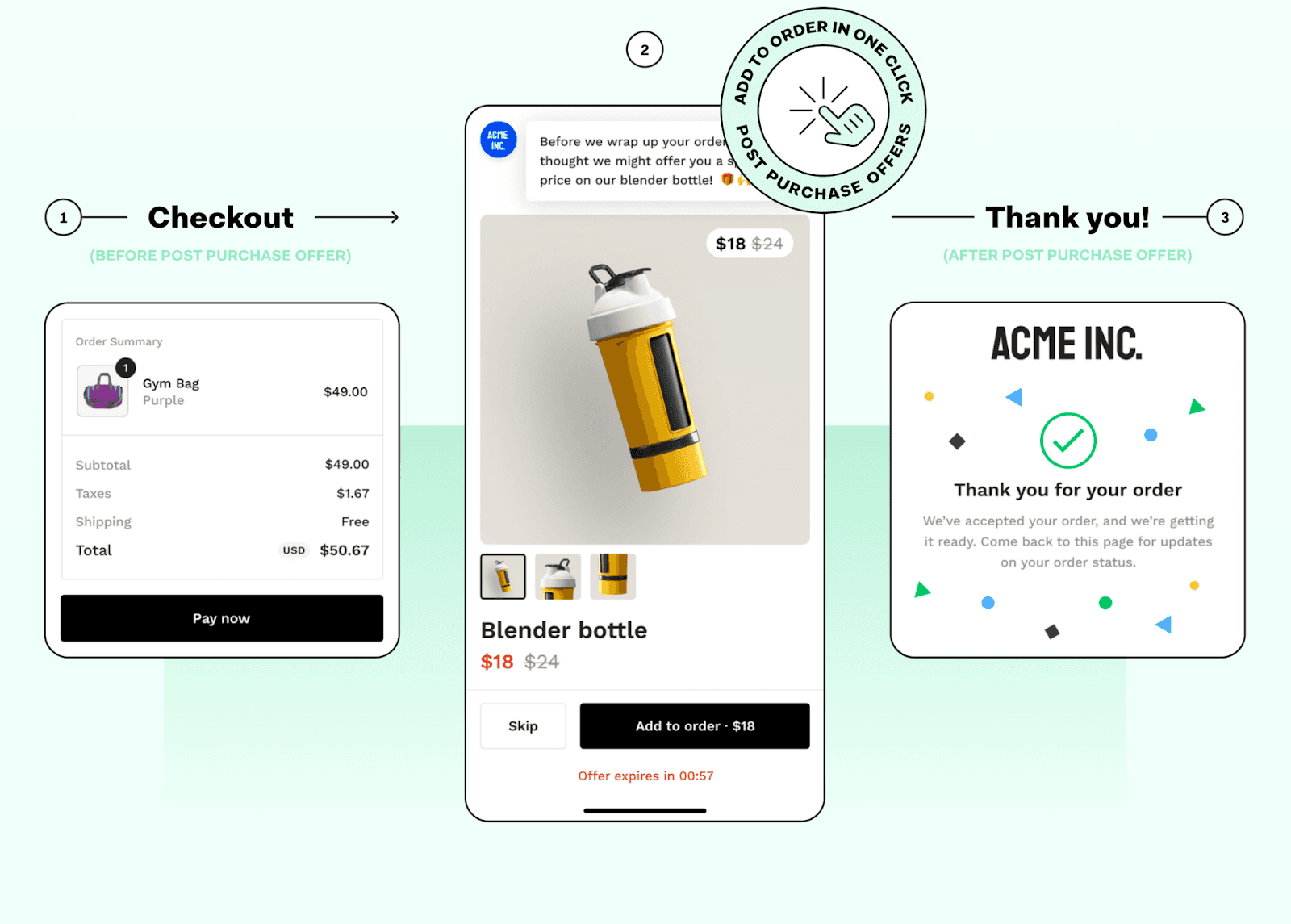
Rally is a headless checkout solution with an agnostic backend and a customizable frontend. Below, you can see an ideal shopper experience we’ve built utilizing web components that have been adjusted with different configurations and styles to meet our needs.
Let’s dig into it!
The challenge → A solution that works for “everybody”
The challenge and why we decided to use web components as a solution for it:
Merchants that are building with a headless checkout solution generally want to have as much freedom as possible when it comes to customizations since most of them have their own dedicated developers. I’m going present the main building blocks for the solution we built that’s meant to work for “everybody”, excluding projects that need to support 🦖!
Brief Intro to Web Components
Web components are a lot like components that are used in frameworks with the exception that they are framework agnostic meaning that they can be used anywhere on the green web, but also follow the HTML element interface.
Wide tech stack support
Web components are a part of HTML specification, so wide tech stack support is something that comes out of the box on modern browsers when using them. This section dives into how to bundle web components in different ways to support the wide stack support from the usage standpoint.
How we went about bundling web components to support wide stack support:
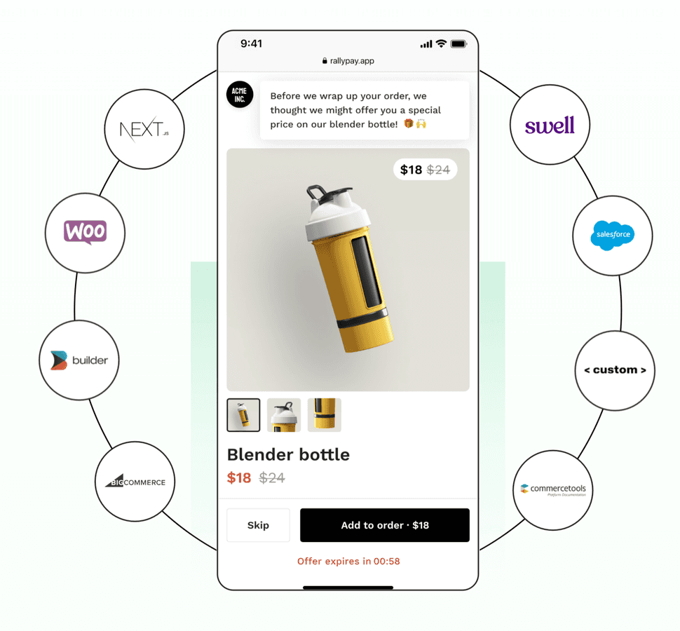
The first aspect of the challenge was providing a solution that works across different platforms and therefore different development setups / tech stacks ranging from NextJS with React, Nuxt with Vue to some other specific template languages that the platforms offer.
Since different stacks require different usage approaches we needed to adjust our builds to offer npm packages as well as inline scripts.
I added some examples of different build configurations with Rollup to showcase what a build config for an inline script vs an npm package looks like.
Inline script build example
NPM package build example
And a showcase of how to export a module so it can be used as a typed solution when creating an npm package.
Export a module as a typed solution for the NPM package example
You can see there were some minor adjustments needed, but to tweak the build configs correctly always takes some time so hope it comes handy if you’ll ever go down this path.
Customizable and Reusable
Due to the requirements of our project we needed to make the web components highly customizable and reusable. This section dives into architectural approaches we used to achieve that.
Leveraging the flexibility of web components
The second aspect of our challenge was to make the solution customizable and reusable so developers can create their own templates with their own UX and UI without needing to think about the complexity of the checkout logic such as payments, address validations, fraud detection or similar…
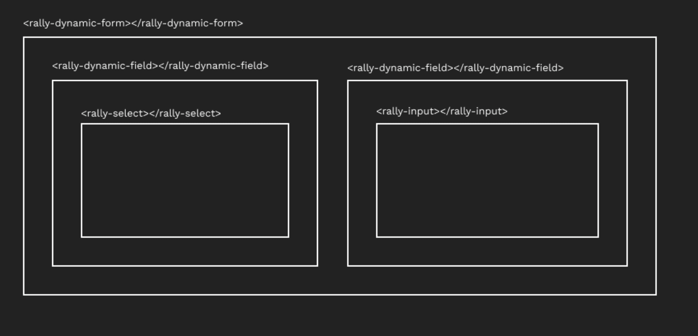
To support our most frequently reused functionality, forms, we created a web component— a dynamic form. The web component is responsible for all of the form logic such as connected validators, form states, and everything else that comes with form implementation.
The dynamic form is built in a way so that you can configure the fields within it as well. The inner field implementation is a custom web component — a dynamic field. The dynamic field can be configured however you need: a text input, select input, or other input types. Additionally, all of these web components can be used standalone, depending on the scenario or usecase you need to cover.
All of the business domain forms you encounter on our checkout pages that use custom web components, such as email, shipping address, and payment forms, use dynamic fields or dynamic forms as the base.
Integration + Configuration
To make the integration of the web component more flexible and the configuration of the web component easier we implemented two different approaches, one leveraging data attributes and the other one our custom built SDK.
Simplifying the integration and configuration usage
The first approach leverages the data attributes with HTML web components. We, for example, pass in the email behavior configuration by pre-setting the consent value to ‘true’ programmatically. You could, however, pass in any or all of the properties that can be seen on the ‘Field interface’ image to the right and override the existing ones.
HTML
Since web components are just standard HTML web components you might also choose to create the web components with all of the configurations dynamically using JavaScript and Web API.
HTML + WEB API
Second approach we implemented is customization using our SDK that allows custom web components manipulation using an exposed global entity.
RALLY'S SDK
With this approach you can create / update / retrieve the specific web component using Rally.elements.appropriateAction – being create, get, update, remove.
An important note to mention here is if we would want to add async validators to our rally-email web component in the example we would need to set those through our SDK versus the data attributes since functions can’t be passed through data attributes.
FIELD INTERFACE
Lightweight bundle with a small footprint
We needed a solution that will be as lightweight as possible. This section dives through different options for the development of web components, comparing them.
Strategies for optimize size to save time and space
The last aspect of our challenge was determining how to make this with the smallest footprint possible. You have different options for how to develop web components, one being no framework at all which might be a bit time consuming so it makes sense to look into frameworks that take care of the boilerplate code for you.
Two strong options for that are Lit and Angular elements which are both developed and open sourced by Google. We currently have three web component repos: two of those use LIT as the framework of choice, and the other one uses Angular.
At the beginning to be quick and efficient we went with Angular elements for all of our repos since it was easier to master one framework at the time — that allowed us to develop stuff at an startup appropriate pace since Angular takes care of a lot, but for us the main aspect was that it comes with powerful forms with a built in reactive approach. As the first solution settled and time went by we were ready to make some optimizations, so we decided to rewrite one repo that has a single responsibility to LIT. That repo in and of itself itself didn’t benefit from Angular’s magic that much so the additional heaviness wasn’t justified.
To give you a better idea of the impact of that change I added some numbers — so the gzipped bundle size with the same logic went from 110kb with Angular elements to 14kb with Lit.
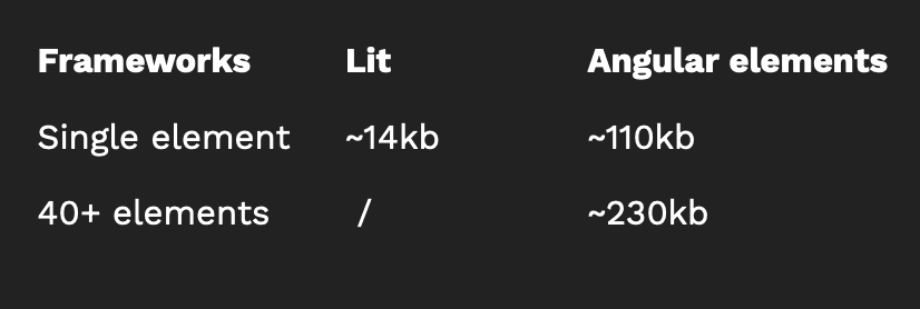
That being said there are scenarios where Angular’s magic is worth the additional bundle size especially if you’re building a set of complex web components. Let me present some numbers here for easier interpretation so if the previous repo which had one responsibility and one web component was 110kb our main repo with 40+ web components is ~230kb which all in all isn’t that bad.
We implemented some additional internal optimizations to reduce the bundle size. One of those was configuring the build to extract CSS and bundle it in a separate file, which does impact the styling approach since you can’t use view encapsulation anymore. Another optimization we undertook was moving external integrations such as Sentry error reporting to a Web worker.
3 Hurdles We Needed To Tackle
Web component slot element vs Angular’s content projection element – At the beginning we implemented web component slot element as a solution for transclusion, but one day out of the blue that stopped working. We were debugging fiercely to figure out what had happened, since there was no internal deploy … after a while we realised the issue appeared after a Chrome update. Long story short, they had a bug that was already present on x version of Chromium, just not fixed before it's made it's way to Chrome.
Well, as you might imagine that doesn’t work well when you have stuff in production, so we needed a solution that would be more stable and by that I mean it wouldn’t easily be affected by external changes i.e browser updates. So we decided to rewrite our slots approach to Angular’s content projection which we knew wouldn’t work 100% out of the box, but we were able to create a fallback that ensures that the web component is placed in it’s correct place when Angular’s content projection fails. The main reason we thought and still think this approach is more robust is because if it fails it will fail under our code changes be it due to framework updates or something else, but we have more power to catch the issue before it’s released.
Configuration through data attributes didn’t work out of the box since the values need to be parsed. As a solution to that we created a decorator that takes care of parsing the data and is added to each web component that’s exposed to the outer world.
State sharing – Since some of our domain web components like payment form and address need to share some data between each other we needed a way to share the state without coupling the web components since we want to allow flexibility – interchanging some for example. To cover this we created a shared reactive store which follows a domain model that is meant to be the data source of truth and all web components can subscribe or dispatch data onto it.
Key Takeaway
If you need an extendable composition driven solution that will work out of the box for different stacks Web components are definitely a good option to consider! I hope this was at least a tiny bit insightful and will help you if you’ll ever in a dilemma if you should use web components.
To experience our web components in the wild, visit our demo store and proceed through the checkout.
